Welcome to my portfolio! :3
I'm Tan, a UX Designer!I could start by saying how I have experience with user research or usability testing but how about we just take a look at some of the work I've done?
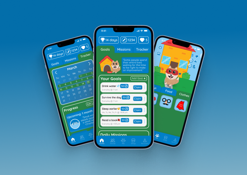
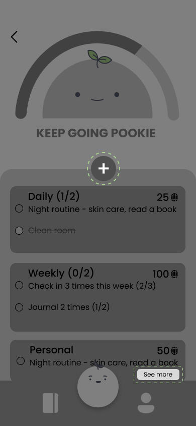
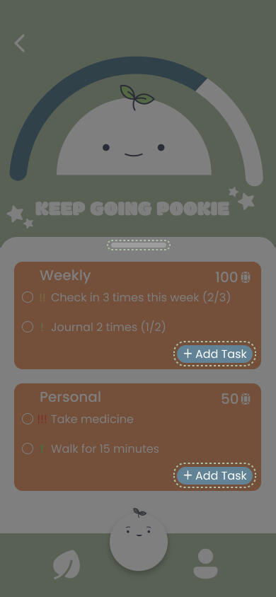
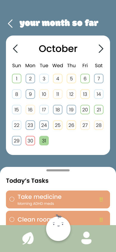
Habit Hero
Crafted a mobile app that makes habit building an easy and addicting experience
Bean
Designed a friendly app that incorporates AI to improve the mental health of college students

StellarSky
Created an academic support app to bring college students together and succeed in their studies
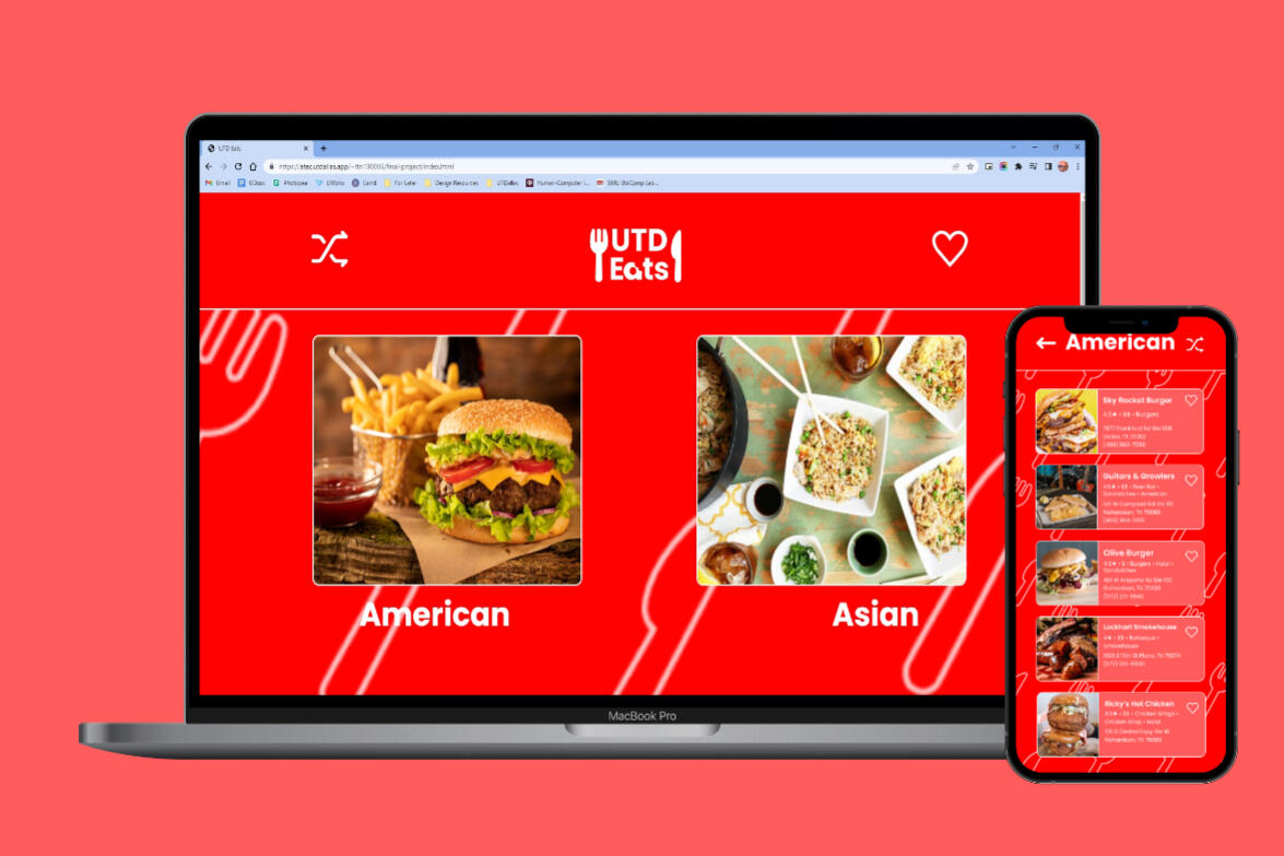
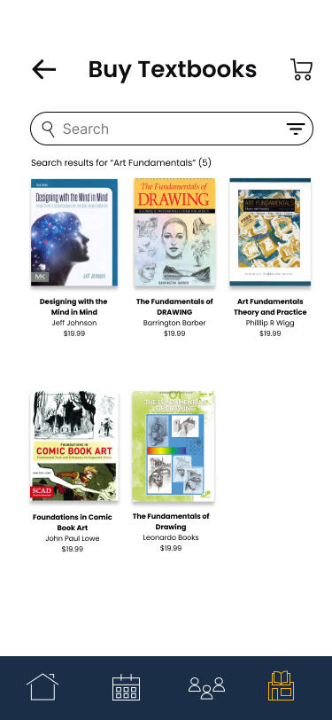
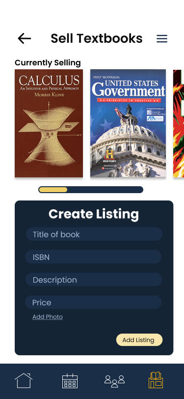
UTD Eats
A web application that provides restaurant recommendations when you need themCheck the website out HERE
Overview
Background
There have been many times when I am hungry after I finish classes and don't know where I should eat. I've noticed that this is a common problem among my friends and various people other people from UT Dallas. Even though I was a junior at the time of making this, there were still many places I hadn't tried and it must be even harder for those that are new to the area such as UTD freshmen/transfer students.
Problem Statement
Although there are other applications that provide restaurant recommendations, their options are much broader and may provide too much information at once. UTD Eats aims to provide restaurant recommendations to those living around the Richardson area and simplify the search process.
Key Deliverables
Site map
Rough sketches
Low-resolution wireframes
High-fidelity mockups
Interactive website
Tools
filler
Figma
CodeAnywhere (HTML, CSS, Javascript)
filler
filler
Timeframe
filler
filler
March - May 2023
filler
filler
Ideation
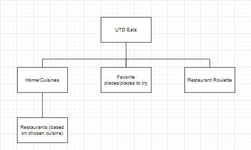
Site Map
I want the user to be able to easily find what they need so I kept the navigation from screen to screen simple. There will be various screens that show the restaurant options besides what is shown here but the idea is navigation from screen to screen should be straightforward.
Sketches
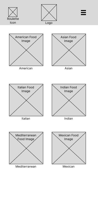
For my sketches, I took feedback about other apps such as Yelp or TripAdvisor and improved upon what they had. I wanted to display information so that it's not overwhelming and easy to digest for users. To make things more user-friendly, I made the layout simple by removing extra elements that take up a lot of screen real estate. I also made it so users can look at reviews once they find a place they would consider going to instead of showing reviews along with basic restaurant information.
Low-Fidelity Wireframe
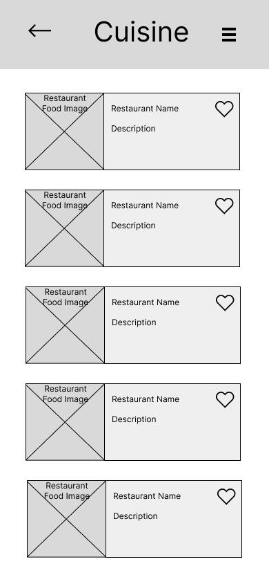
My wireframes cleaned up the sketches and gave me an idea of how things should begin to look. I also thought ahead while creating the designs and thought to myself, "What kind of design can I create with CSS?" This translated to a simple design that users can easily navigate by meeting their expectations of where things should be and how features should work. Navigating from one page to the next is a consistent experience throughout the application and adds on to the meeting of expectations.
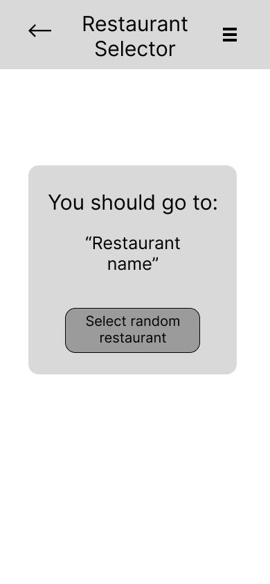
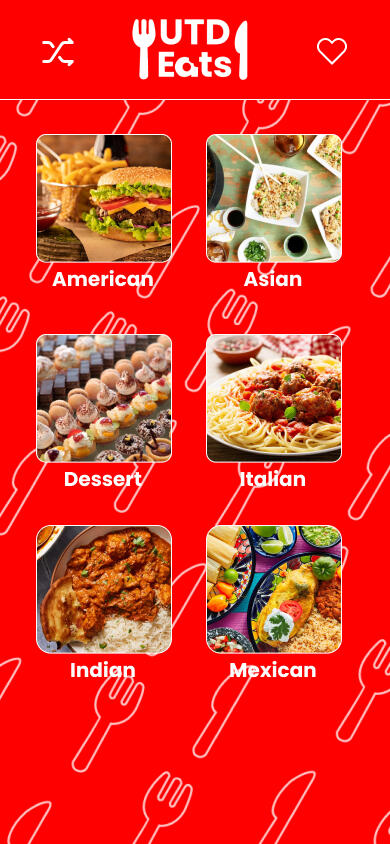
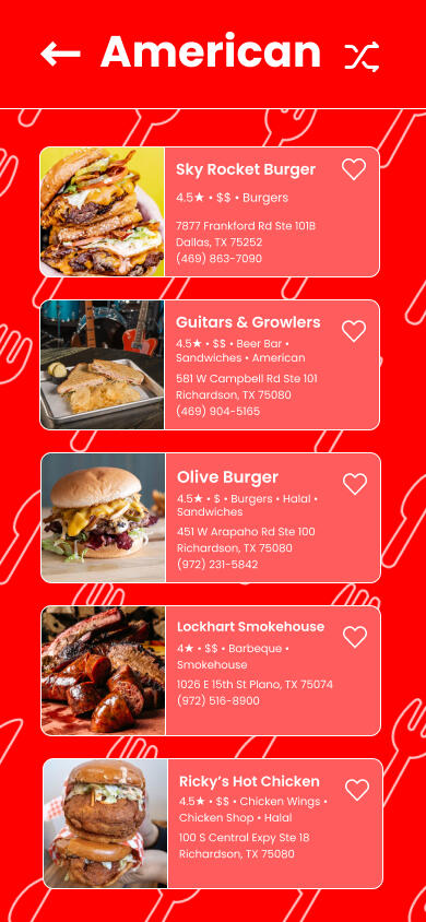
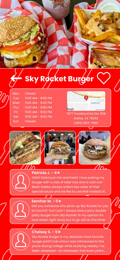
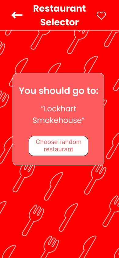
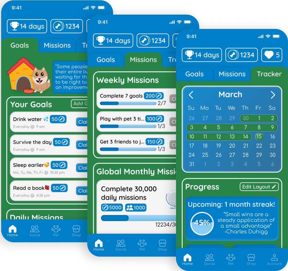
Final Prototype
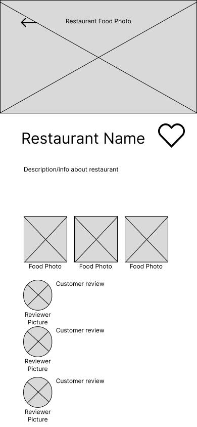
The prototype screens I created in Figma captured the simple design I had in mind to make sure users aren't overwhelmed but are able to find what they are looking for. The navigation of the application is intuitive and in a way repetitive so users can predict how certain features will behave. With the use of progressive disclosure, users aren't overwhelmed by all the options and can narrow down what they would like. I also implemented restaurant reviews at the end of the user's navigation to aid in the process. Instead of how Yelp or FourSquare had random low quality reviews at a glance, users can decide what they wanted initially based on cuisine or location of a restaurant. When a user looks into a specific restaurant, they can see specific high quality reviews of important characteristics of a restaurant and then user other's opinions to decide if they want to go there. Being at a specific restaurant page can be the end of their journey of choosing a restaurant and they don't like it, they can repeat the navigation they just went through until they find a good place to try.On top of the simple designs, the visual design of the application is made with the user in mind. The vibrant red creates a sense of hunger in the user and makes them want to eat. Along with a secondary white and a simple sans serif font of Poppins ties everything together. The simplicity doesn't create too much visual clutter for the user and helps create a pleasant experience while they search through a sea of restaurant information.
Reflection
Creating UTD Eats was my first experience coding an application using HTML/CSS/Javascript. There was a lot of learning about translating a design from Figma into a functioning web application, but it was a useful and eye-opening experience. I learned a lot about laying out elements using HTML and CSS and now have a better understanding of the process of taking a Figma design and creating it with HTML and CSS. There were some parts of the design that I had to tweak which I'll keep in mind when I'm designing along with being mindful of what is realistic for developers. I'm more aware of how designers can make complicated designs that are hard to implement and this is something that I am more wary of now.
Overview
There are many students, especially those at UTD who run into obstacles that hold them back from succeeding with their academics. They struggle with things such as time management or being able to get the help they need on their assignments. UTD doesn't provide the assistance for everyone's needs so our goal was to provide the necessary resources to help university students succeed in all areas of UTD.
Key Deliverables
Interview and survey insights
User persona
Paper prototype for usability testing
High-fidelity mockups
Final interactive prototype
Timeframe
filler
filler
August - December 2022
filler
filler
Team
Tan Nguyen (that's me!)
Vicky Nguyen
Jake Rubio
Skyla Lopez
Michael Murphy
My Key Contributions
Collect user research via interviews and surveys
Conduct usability testing and gather insights
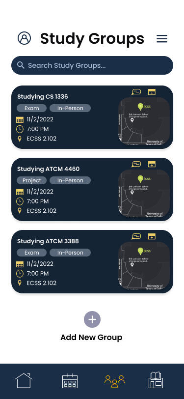
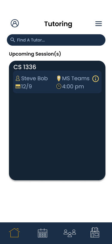
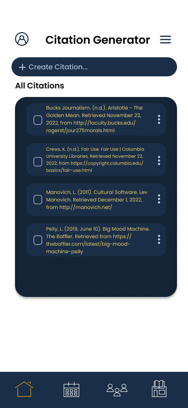
Design prototype screens (tutoring, citations, & textbook marketplace)
Research
Interviews
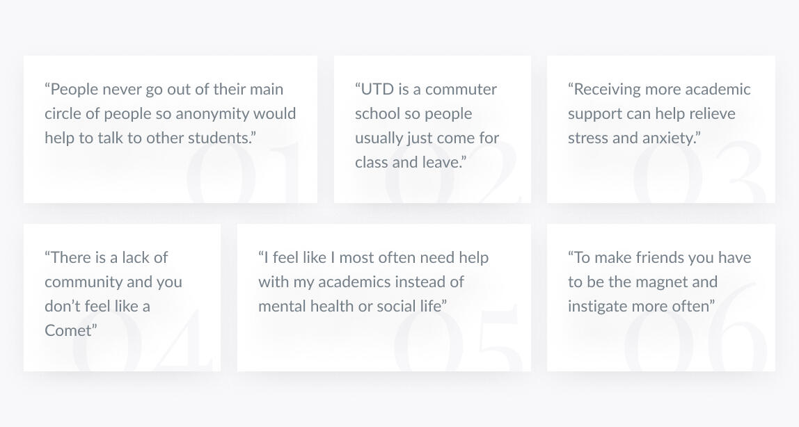
Our initial interviews included various questions that would help us figure out student pain points. We found that the pain point of many students is that there is a lack of academic support. We continued looking into that by learning about what was missing at UTD and what features would help support students academically.Findings from the interviews is that there is a lack of academic support at UTD. Even the lack of expansion of social circles shows that it can be hard to reach out for help with this fear of being the odd one out. There needs to be a way to change this stigma and help form stronger, closer communities of people that provide support for student academics.
filler
filler
filler
filler
filler
Surveys
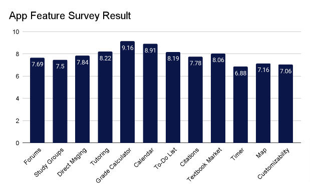
After the completion of interviews, we brainstormed possible features that should be included. To know what to implement, we used an online survey and shared it among UTD students. The survey asked people to rate features on a scale of 1-10. Based on data, we decided to not include the timer, map, and customization features as they were rated lower and were not valued by students. The more popular features were the grade calculator, calendar, and tutoring which we made sure to include.Observations from this feature-set survey is that students are more focused on their academics and want to maximize their efforts through features such as a grade calculator or having a calendar to keep track of all their tasks.
User Persona
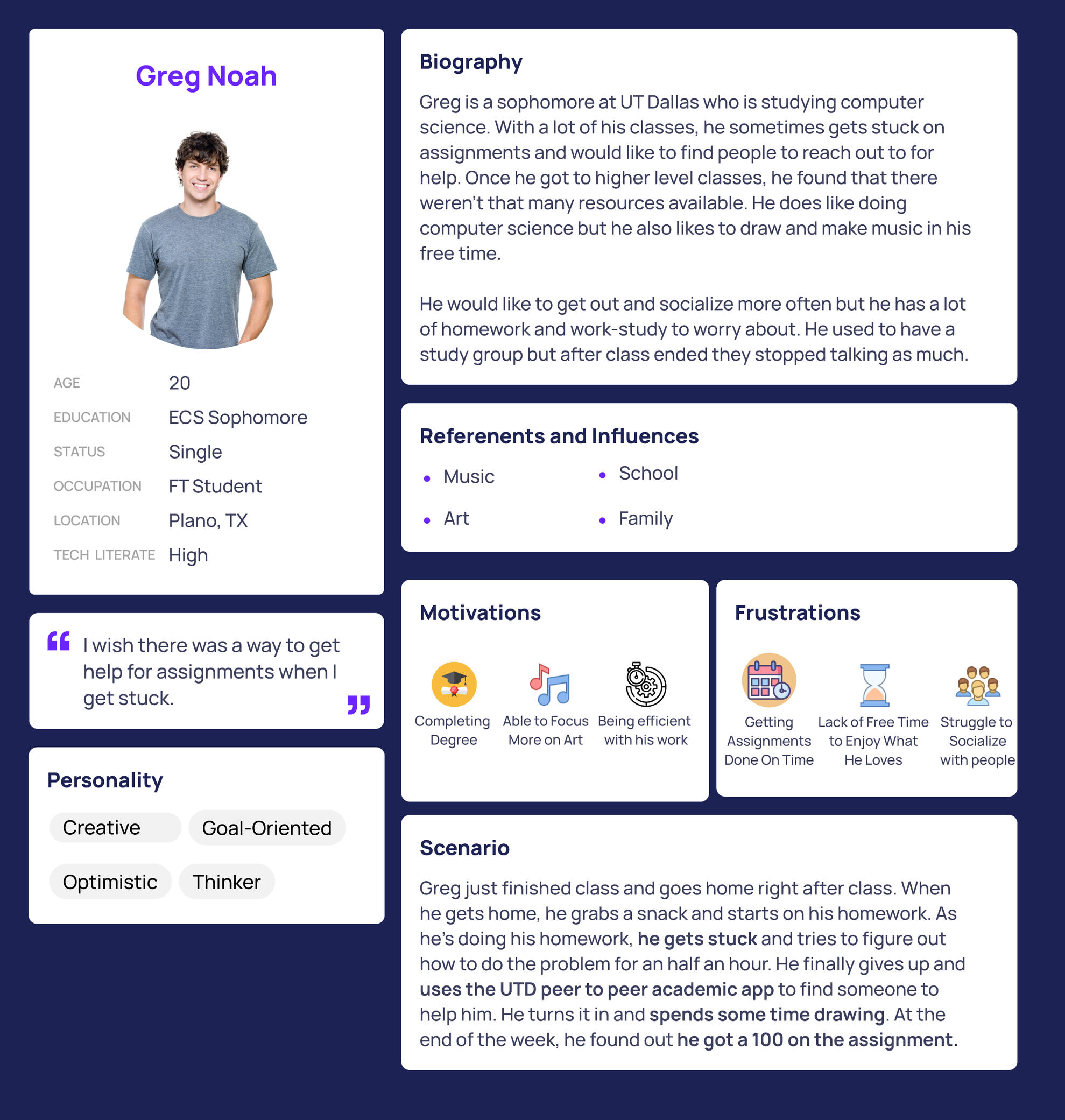
We wanted to have something to refer to as we continued working on our app so we created a user persona based on information from interviews and surveys. We used that data to characterize different traits we recognized and bring focus to user pain points. For Greg, we found that he had goals of succeeding but was finding it difficult due to the lack of academic resources that could help him at UTD. He needed something or someone more accessible to be able to get through his complex homework.
Ideation

Sketches
We roughly sketched out how the login, home, calendar, and study group screens would look. Our sketches gave us a rough idea of how we wanted to place elements and is what we would create in Figma for usability testing with paper wireframes.
Low Fidelity Wireframe
Using Figma, we made wireframes based on our sketches. We created these wireframes to be printed and used for usability testing in which we got some good preliminary feedback for our app.


Usability Testing & Iterations
Before
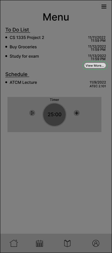
Users had a hard time trying to figure out how to add a task with just a "view more" button
Text
After
To make it clearer, we changed the text for the button to "Add Tasks" and included a plus icon

Before
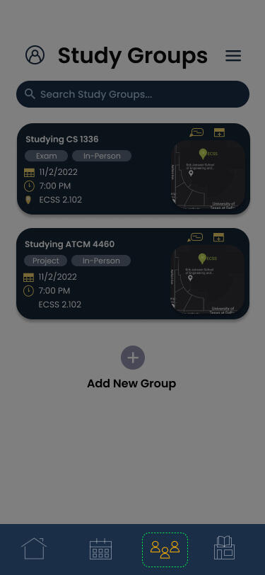
The original icon for the study group feature being a book caused confusion for users

Text
After
We changed the icon to a group of people to better represent a study group
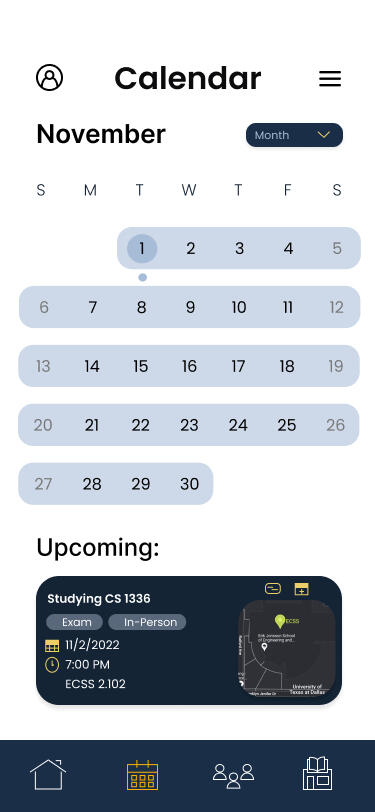
Final Prototype
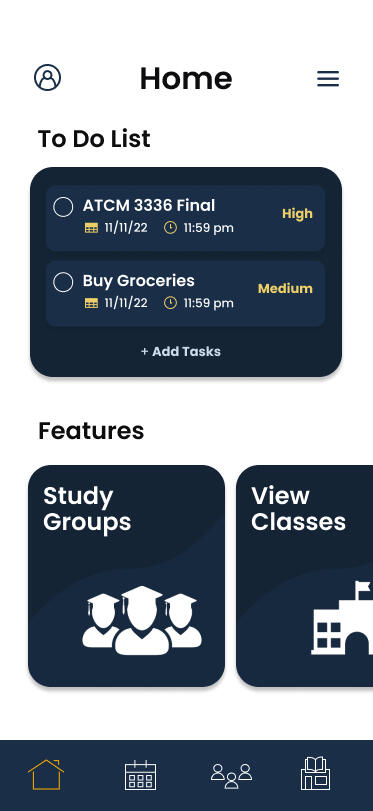
We refined and expanded the various features students said they would like to use to improve their academic performance. One specific issue we came across was showing all our features on the home page so we opted to use a scrolling carousel to keep the home page from feeling cluttered but keeping easy access to all of our features.
Reflection
This was my first time using Figma, but I was able to adjust and learn how it worked pretty quickly. I learned how to create various screen designs and prototype them over the span of this project. I was also able to work with a group of other student designers and use teamwork/communication to brainstorm ideas, figure out trends in our research, and collaborate on our designs. I learned that it can be difficult to constantly communicate things with a handful of people but picked up early on that it was important for all of us to stay on the same page and keep the same vision in mind. Overall, I learned so much and there is so much that I can do better the next time such as figuring out how to keep designs consistent or figuring out how to get higher quality user research.
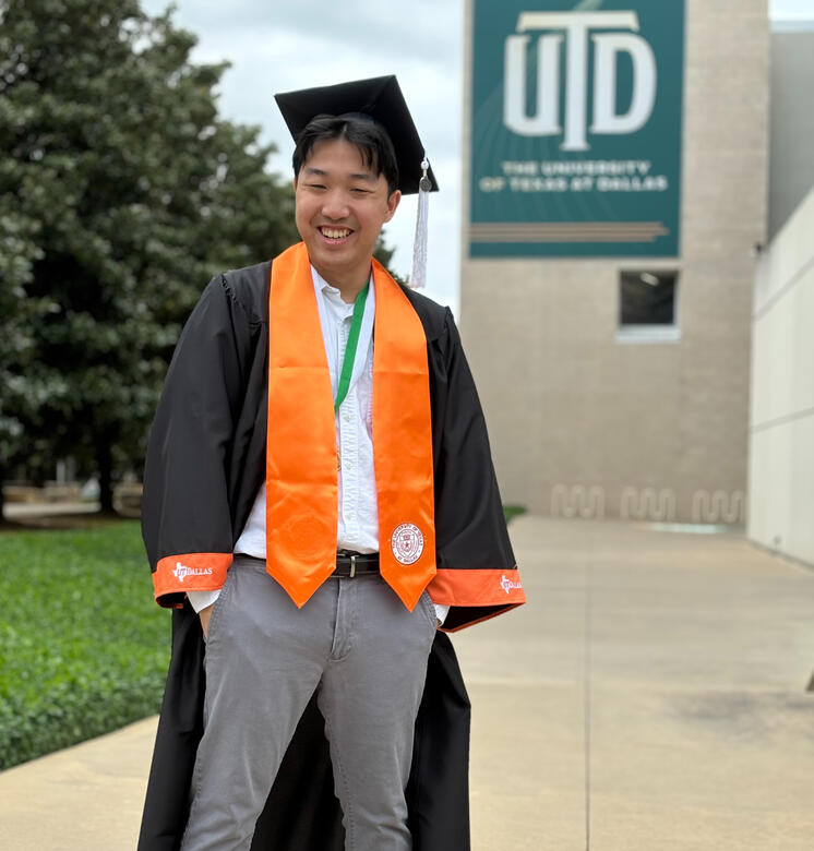
Hi I'm Tan! :D
I'm a UX designer who mainly has experience in creating mobile designs. I've worked with Figma, HTML, CSS, JavaScript and have taken part in all stages of research. I've conducted user research such as primary/secondary user research, qualitative data analysis, and usability testing. My goal is to analyze user pain points and create innovative solutions.A little bit about me is that I like to play video games such as Valorant, Rocket League, or Honkai Star Rail. I also like to watch a lot of shows like anime or K-dramas. Some of my favorite animes are Spy x Family or Oshi no Ko and my all-time favorite K-drama is Reply 1988. You should watch that if you wanna cry :,)
Overview
The objective of this project was to create a mental health app that utilizes AI to help college students.
The Problem
44% of college students report symptoms of depression, 37% say they have experienced anxiety, 15% considered suicide, and only 36% consider seeking help. There must be a reason why so many students suffer but continue enduring their issues. Through our research, we found the major factors that deter students from seeking help are a lack of time, energy, money, and lack of trust in professionals. With the issue of trust, people also don't trust AI since it's fairly new and still being developed. These are all important factors we should consider as we create our app.
Key Deliverables
User surveys & interviews
Affinity map
Mid-fidelity wireframes
High-fidelity mockups
Interactive Prototype
Time Frame
filler
filler
August - December 2023
filler
filler
Team
Tan Nguyen (that's me!)
Manasa Paruchuri
Shriya Vanparia
Aia Pascalia
Paige Kelley
My Key Contributions
Gathered secondary research through interviews
Ensured design consistency based on design needs
Designed initial wireframe designs (daily check-in, calendar, progress bar)
Developed interactive prototype, created key interactions and animations across screens
Research Findings
Trust
People trust those they are close with such as friends and family so we need a way to gain their trust
Balance
The biggest issue affecting the mental health of students is balancing work, school, and their personal life
AI
People are skeptical about AI with a lot of people feeling neutral but answers are still skewed negatively
Problem Statement
"How do we encourage trust between users and AI in a way that allows college students to find accessible mental support quickly and efficiently?"
Ideation
Using our findings from research, we created a user persona and affinity diagram to identify pain points and get an idea of how we should narrow down our ideas.
Learning About Our User
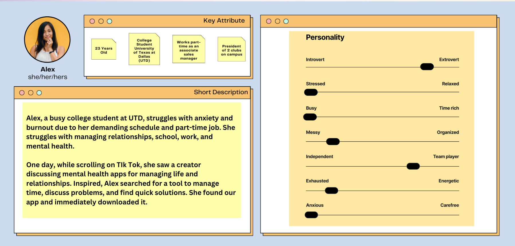
We created a user persona to figure out who our primary users were. This persona was based on findings from our research and we found that Alex is an outgoing girl who struggles with saying no. Because of this she is overwhelmed and struggles to balance all her responsibilities. She could try to see out help but it's hard trying to balance work with school and seeking help would cost her time and money.
Text

Features for the User
With Alex in mind, we brainstormed what features would be useful to her and those in a similar situation. We decided to narrow our focus on the lack of time and energy.Our app addresses (school) work-life balance and mental health issues. We are aiming to provide a fun, enjoyable experience for users to improve themselves.
Mid-Res Wireframes
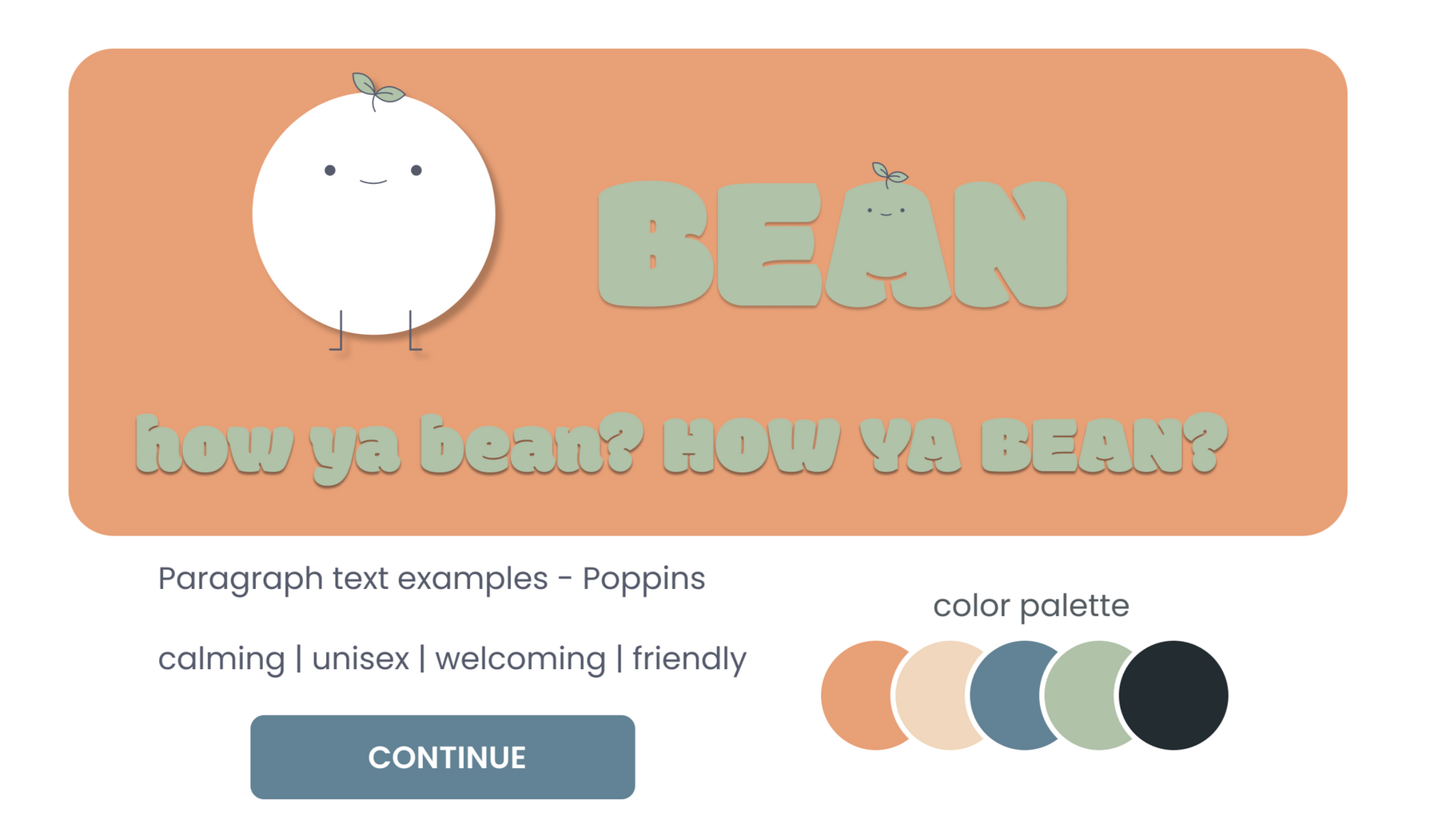
Our wireframes highlight our main features, a 1-2 minute daily check-in, a tracking system, and mental health resources. The tracking system allows users to see if they're progressing while mental health resources provide useful things like meditation or journaling right at the user's fingertips.The app uses a friendly, AI-powered mascot, Bean, to interact with users. Bean's simple shape and cute expressions create a welcoming atmosphere and phrases like "how ya bean?" or "talk to me bestie" create an enjoyable environment for users to improve their mental health. Bean breaks the barrier of trust by being a supportive friend to users and helps as an AI by suggesting tasks, giving reminders when needed, and providing helpful resources.


Final Touches
Turning our wireframes into a high-fidelity prototype, we finalized the designs and included our color palette to present a fun and friendly brand. We want to emphasize ways to balance your life along with techniques to reduce mental stress by using AI as a supportive tool.
Exploring Our Brand
Our lead designer, Aia, put together our brand guidelines. We decided that we wanted something friendly and welcoming and one way was with a fun and interesting header font, Modak. As for our colors, we wanted something calming and soothing, so we have a color palette that uses pastel orange, blue, and green.
Design Iterations
Before
The use of the 'plus' and 'see more' button was clunky for the user and made the experience unintuitive.
filler
filler
filler
filler
filler
After
We opted for the pill so the user knows they can slide up on their tasks and the 'add task' buttons are placed with the user's tasks.
Before
We wanted to be unique so we originally tried a weekly calendar layout that would show the user's moods from daily check-ins.

filler
filler
filler
filler
filler
After
With feedback, we realized users would rather see and are more comfortable seeing the whole month. As the old saying goes, "Don't reinvent the wheel."
The Final Prototype
These are our main final screen designs which showcase ways to keep track of mental health, improve it, and maintain mental health all while implementing our friendly AI companion, Bean!


Reflection
Users Come First
There were a few times when we were confused with our ideas because we didn’t know what to focus on but what helped us was putting our heads together and going back to our research to see what users really needed. The user is indeed the king! 👑
Text
Text
Usability Testing
Due to the lack of time, we didn’t get to conduct usability testing but I wish we had the time to see how we compared to other apps or if there would be unnoticed problems. The design journey never really ends and this would've been helpful for us to look for improvements. 👍
So Much Improvement!
Overall, this was a wonderful experience and I learned many new things from my brilliant team and improved on my own as well. I learned many new Figma skills and will look forward to implementing all this knowledge into upcoming projects! 😺
Text
Overview
For those wanting to build healthy habits, Habit Hero can help them overcome procrastination and lack of motivation by providing a fun and addicting experience.
What's Going On?
It can take up to 21 days to form a habit and 90 days for a permanent lifestyle change. Trying to do things for that long and seeing little progress can be discouraging to people. On top of that, people can be forgetful or life gets in the way.
Key Deliverables
User Research Findings
User Personas
Competitor Analysis
High-fidelity mockups
Interactive Prototype
Time Frame
filler
filler
January 2024 - May 2024
filler
filler
Team
filler
filler
Tan Nguyen
filler
filler
What issues do people face?
I started by trying to figure out what obstacles people may deal with in regard to habit building. I ran interviews and surveys with a variety of people online and in-person. In the end, I collected responses from 25 potential users and this is what I found:
Motivation & Consistency
16/25 people have issues with motivation and maintaining consistency
Forgetfulness
10/25 people mention that they
are forgetful
Time
6/25 people say it's hard for them to find time to commit
What's the problem I'm trying to solve?
"How can I create an experience that motivates people to develop their habits while considering outside factors?"
So who is the user?
With a good set of data, I learned important things about people trying to form habits. Now I needed to decide who I was trying to design and solve a problem for. To do this, I analyzed all the people I interviewed and surveyed to come up with two user personas. These are the people that I would be keeping in mind throughout the creation of this app.
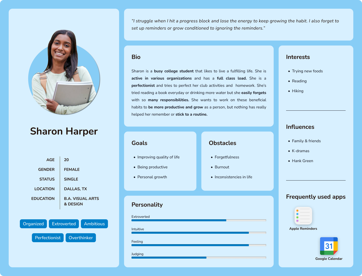
The Primary User
The primary user is a busy college student aged 18 to 24, struggling to balance personal needs and new habits while adapting to a new living situation. They want an app that makes it easier to track habits and is fun to use to stay motivated.
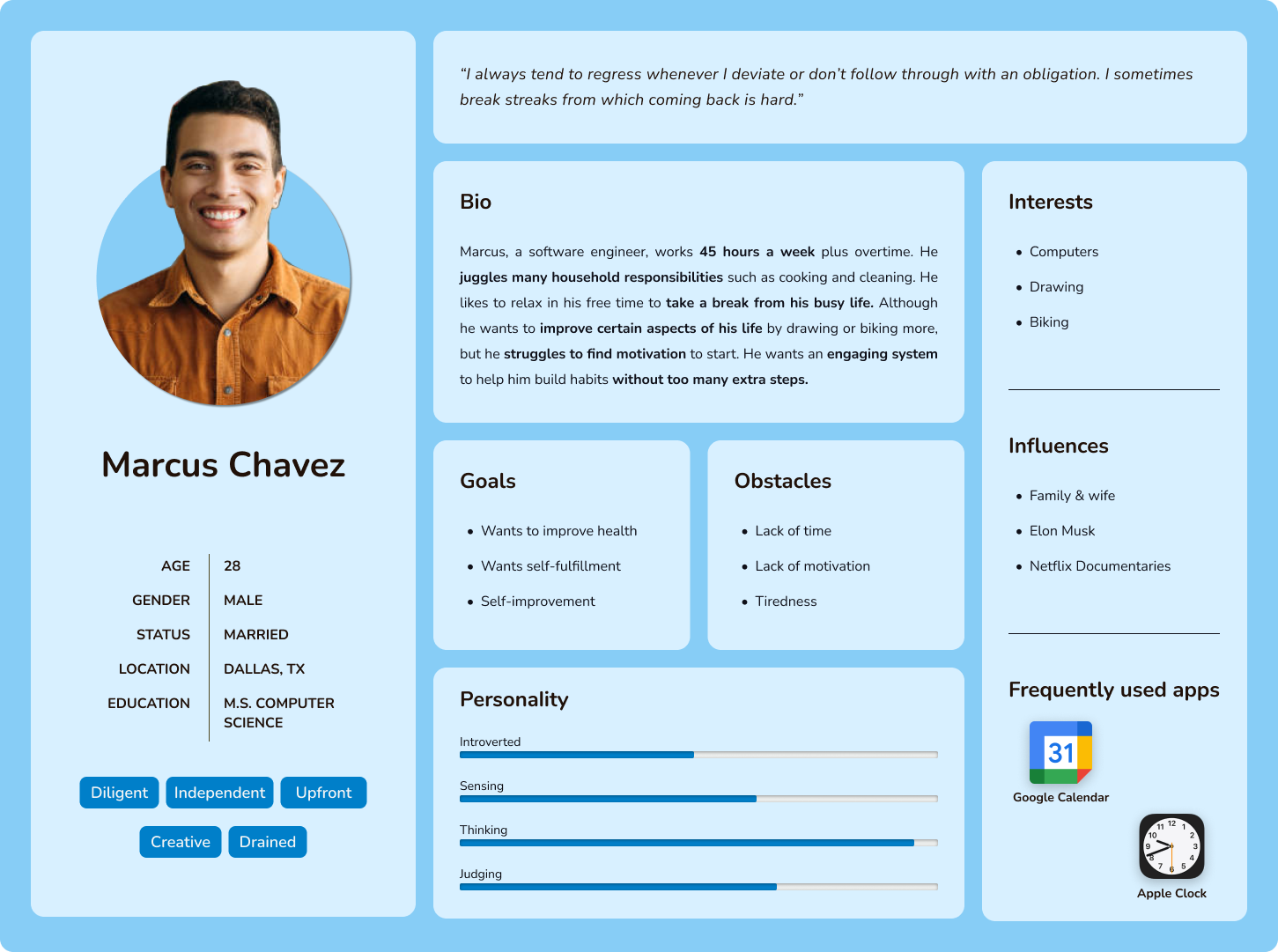
The Secondary User
The secondary user is a busy individual aged 28 to 34, juggling work, household responsibilities, and his personal life. In his free time, he lacks motivation due to exhaustion. He wants a straightforward app with features that will keep him engaged.
Who are the competitors?
To see what I could do better, I researched existing apps that also help with habit-building. Some key things I found were:
Eden
👍Just simple enough
👍Great atmosphere
👎Lacks instant rewards
👎Locked features behind subscription
Habit Rabbit
👍Cute pet rabbit
👍Competitive aspect
👎Limited habit tracking
👎Overwhelming outside of habits
Habitica
👍Accountability
👍In-depth game & habit system
👎Complicated
👎Time consuming
Smile To Do
👍Easy & straightforward
👍Up-to-date reports
👎Too simple/lacks rewards
👎Paywall
filler
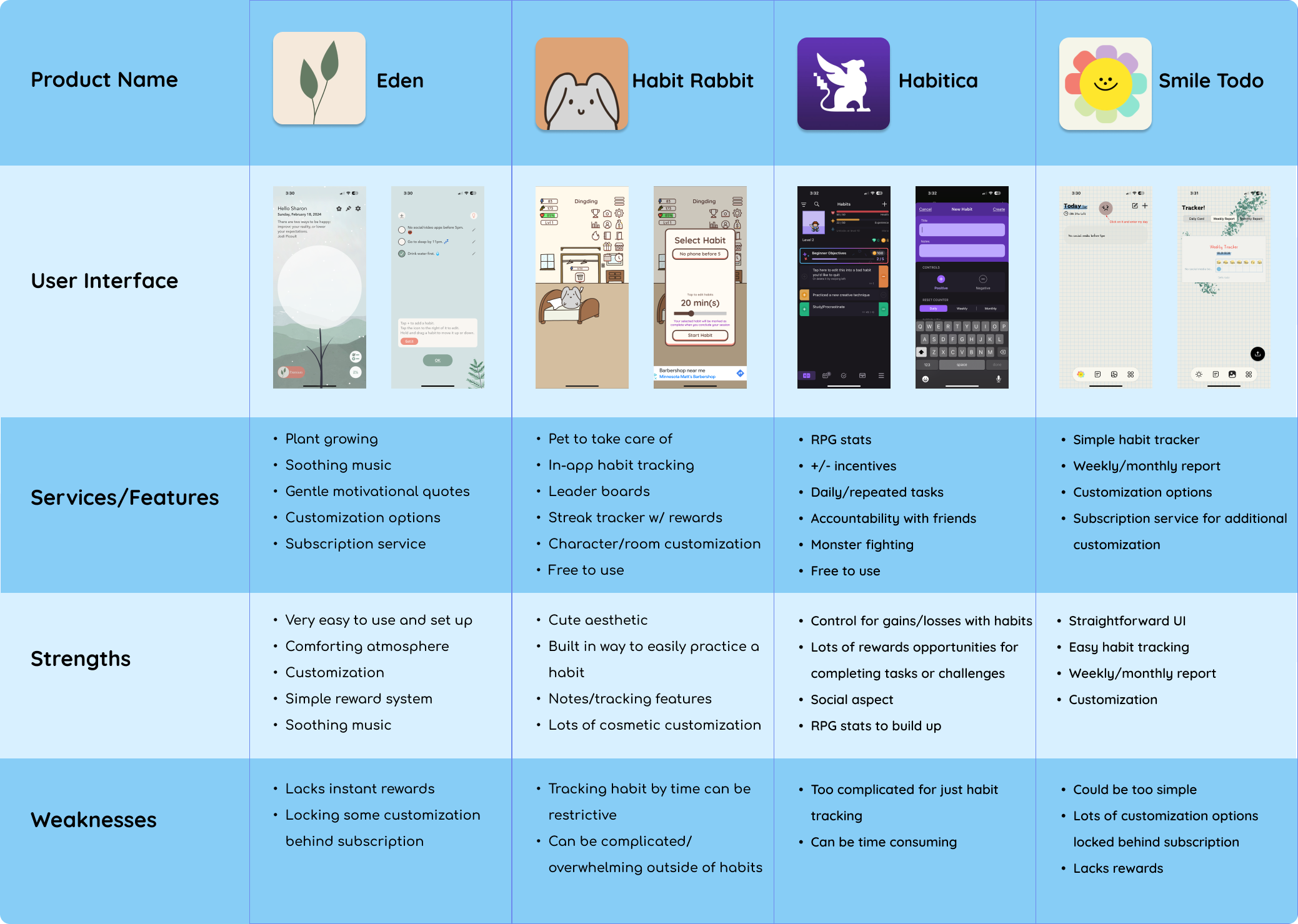
In-depth graphic of competitor analysis
So what? What will I do differently?
I will aim to create a pleasant and straightforward user experience, avoiding unnecessary complexity while providing enough content to motivate users to stick to their habits. Emphasizing rewards is crucial, as instant gratification will help users see progress, especially early on. Rewards can differ for longer-term goals, creating a variable reward system, and helping to keep users engaged. I will also avoid a subscription service, as it might deter users. Instead, I'll explore other ways to generate profit, ensuring the app remains helpful and accessible.
Early Design Ideas
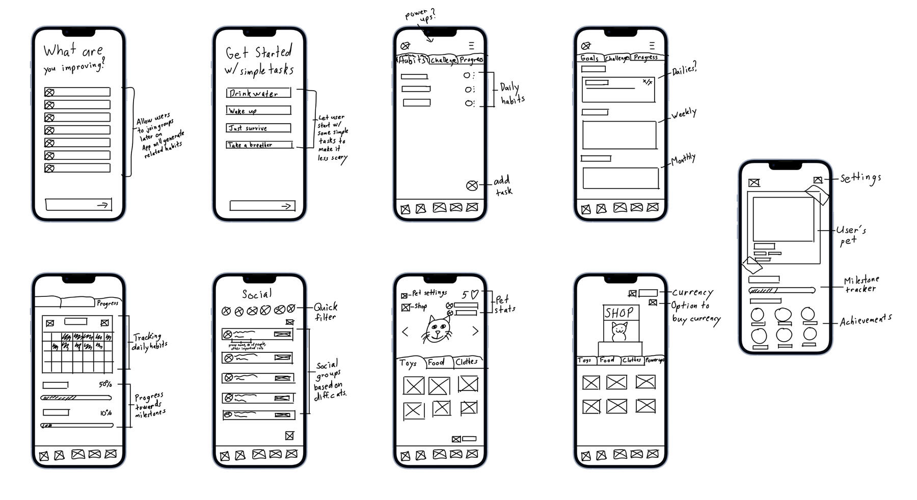
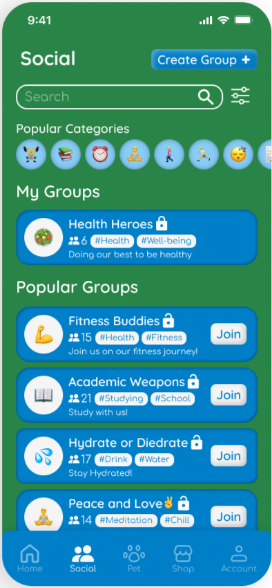
I thought of ways to ease people into building habits through camaraderie/accountability with other people or by starting them with simple tasks.
I also considered ways to engage people through challenges to keep them motivated and have a system that uses variable rewards to keep users interested.
There are also simple iterations on what stat tracking or a pet feature would look like.
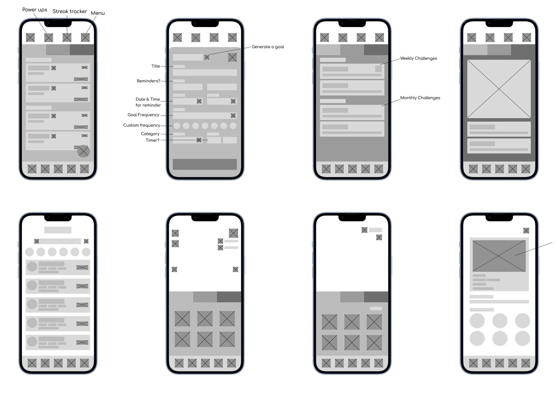
I refined my sketches with lo-fi designs and thought about the layout for the main function of habit tracking. I grouped user goals with daily challenges as those should be the main focus for the user and they can gradually work on the longer weekly/monthly challenges.
I also wanted to get an idea of what a person would need when setting up a goal so I visualized and considered what information would be important to include.
How do I represent the app?
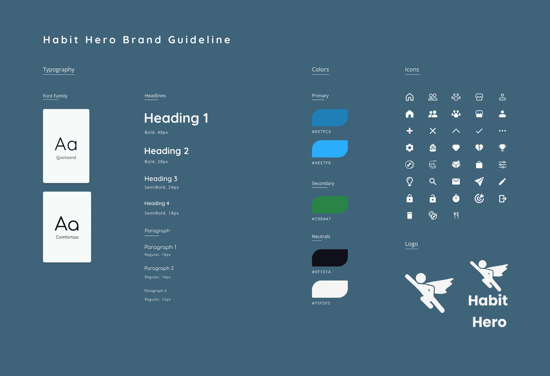
I wanted a fun, youthful, and friendly brand. That led to the decision to use Quicksand and Comfortaa which are rounded sans serif fonts to portray welcoming characteristics which would also help users feel comfortable with starting new/maintaining habits. I also chose fun and vibrant colors for my app, that being blue and green. Additionally, these colors help with focus, concentration, and increasing efficiency which would be beneficial to users. The icons, along with the logo, follow themes of being rounded for the friendly brand as well as being full in shape.
Fleshing out the ideas


Design Iterations
Before
The animation for finishing tasks shot some confetti but didn't clear the task away which made it cluttered.
After
After finishing a task, it is cleared off the screen, making it clearer what task is done, and declutters the space.
Before
Different sections were blending together and made it hard for some users to follow the flow of a page.
After
I improved the separations between sections and applied that to other elements for design consistency.
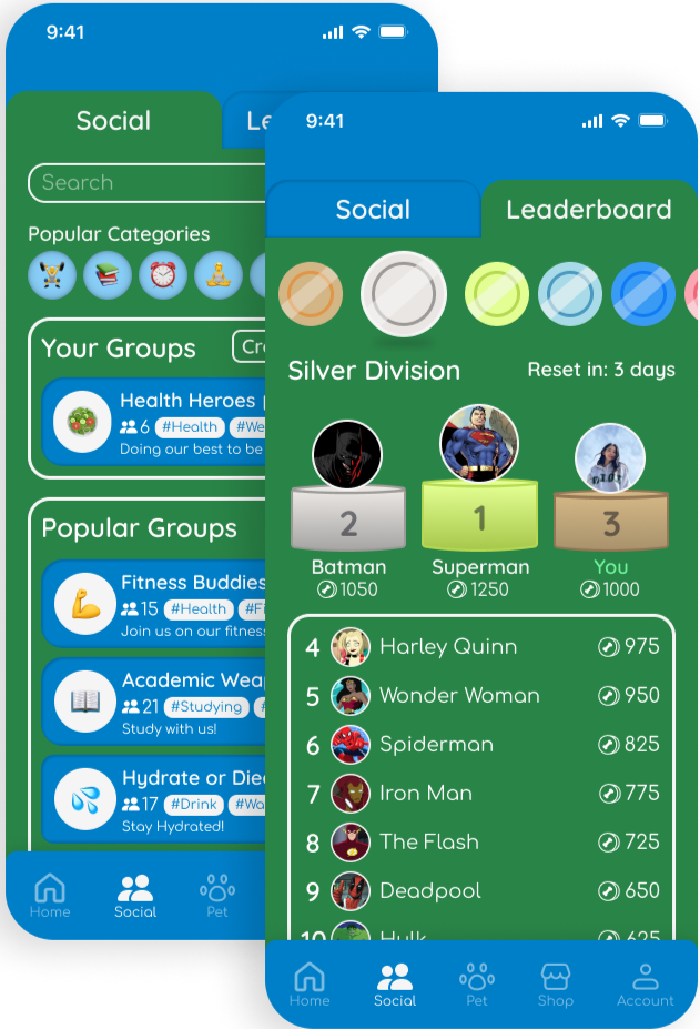
Before
I realized users who only log in to check off their habits or don't care to interact with their pet lack the incentive to continue. There is the group feature to join people with similar goals but that can also be time-consuming.
filler
After
To help motivate these users, I added a leaderboard system that ranks people based on the amount of coins they earn in a week, adding a simple competitive appeal for users.
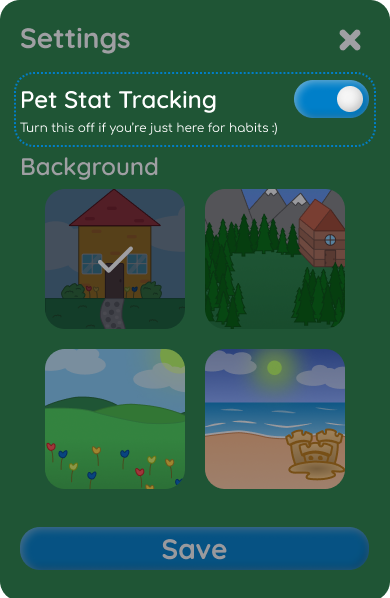
Before
The setting to turn on or off the changing of pet stats was unclear with just the original name and had no description to go with it.
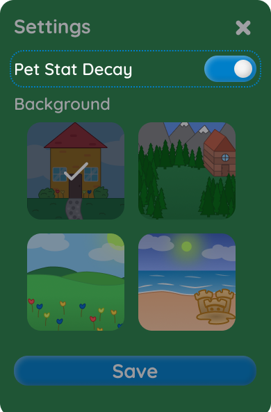
After
I reworded the name of the setting to be clearer and easily understandable. I also added a small excerpt to explain what it does.
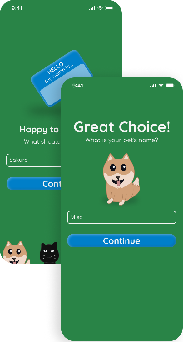
Before
Some onboarding screens were plain and had no added visual elements. This made the onboarding experience dull and didn't represent the brand identity.
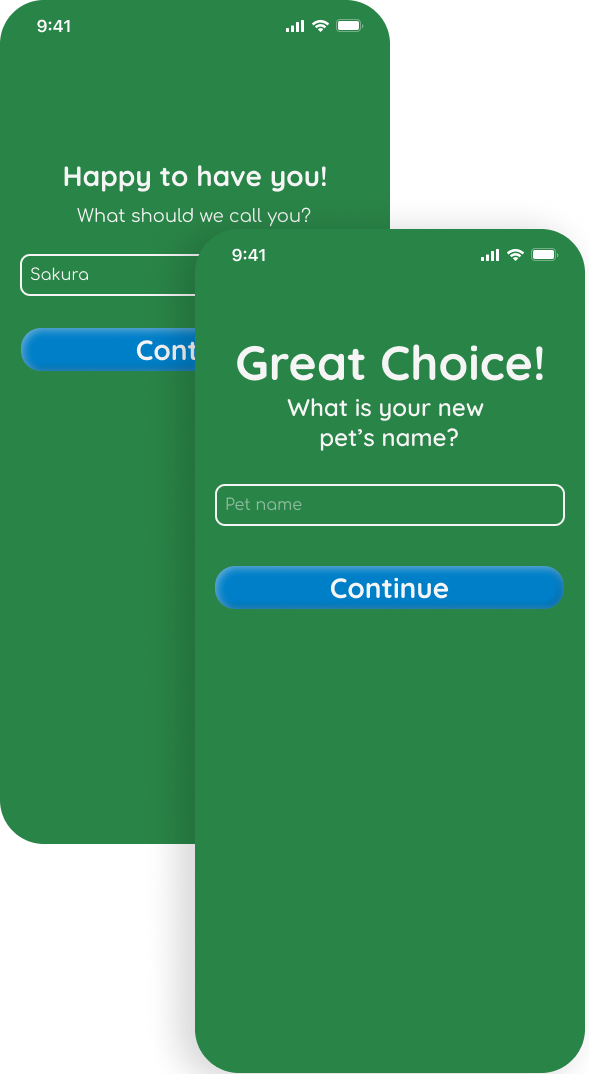
After
I added visual elements such as the name card plus the pets to make the screens more appealing and align with the brand attributes.
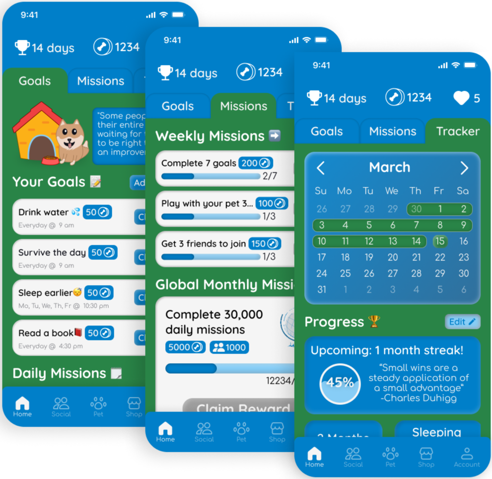
The Interactive Prototype (~2 1/2 mins)
What Did I learn after all this?
Being more efficient
This was such a great learning experience! It was my capstone project which is my senior project to show off what I've learned in my four years at the University of Texas at Dallas. I used what I'm familiar with and explored new design processes as well. I experimented with different aspects in Figma such as setting up a wide variety of components to make the app feel alive and combined that with Figma styles to make my workflow more efficient.
Bringing value to the user
Throughout the project, I focused on adding useful features and value to my app. One major challenge was designing a user-friendly and motivating system. I initially implemented a pet system to give users a sense of responsibility and encourage regular use. However, realizing that some users might not be motivated by this, I added a leaderboard and ranking system to foster competition. This sort of problem-solving guided my thinking throughout the creation of this app and resulted in a polished final product.
Experimenting with user testing
If I could have done anything differently, I would have experimented with more user-testing software. Trying to find software that met all my needs, like heat mapping and including a broad range of users, was time-consuming. As a result, I stuck with regular user testing and used those around me. Although I received valuable feedback, I believe using new software could improve my efficiency and results in the long run. Overall, this was a great experience, and I'm excited to apply what I've learned to new projects!
Shoot me a message 😊
